The Artist's Magazine - November 2011
Brushing Up: Light in Winter
Pay attention to color temperature as well as value in order to lift winter landscapes out of the duldrums.
By Peter Fiore
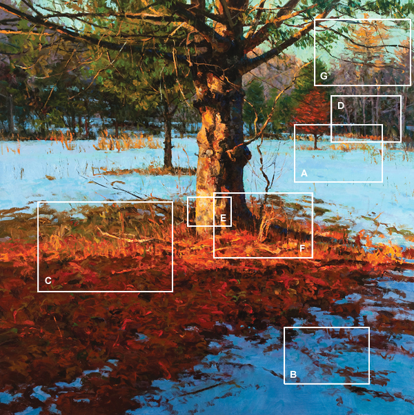
Rising Sun, oil/panel, 36x36 inches
WINTER CAN BE a bleak time of year, but painters can transform an ordinary gray day into something spectacular. The secret to infusing your winter landscapes with vibrant color lies in understanding how color values and temperatures interact with one another.
Winter Shadows and Skies
Always remember that you paint the effect of light on your subject, not the local color of the subject. For example, when strong sunlight falls upon a subject and creates cast shadows, the observed value of the shadows is dark, creating an extreme contrast with sunlit areas. If painted as observed, the shadows on snow can seem heavy and foreboding. To remedy this, I raise the value of the shadowed snow to approximate that of the sunlit portion of the snow—but with one adjustment: I differentiate the sunlit snow from the shadowed snow by adjusting the color temperature. In other words, I make the sunlit portions a little warmer and the shadows a little cooler. This preserves the illusion of light and shadow while brightening the overall effect of the scene.
The interplay of color between sky and snow also deserves special attention. In Rising Sun (at left), as in all landscapes, the sky plays a key role in determining the overall color, atmosphere and mood. In winter, however, this is much more obvious because the ground plane, which is white with snow, is a wonderful reflector.
Let's get into some specifics of how I painted Rising Sun.
A - Field
In the snowy, cloud-shadowed field in the background (A), I kept all color shifts within the same value, which makes the field appear to stay in its place and lie flat. The varying hues include greens, blues, lavenders and pinks.
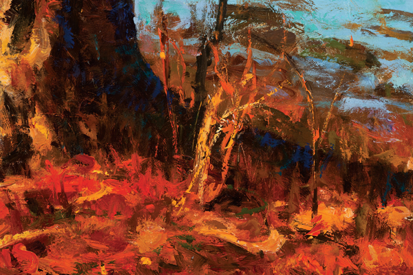
B - Snow
In the lower right corner (B), the patch of snow contains the same color notes but at a lower value to create a deeper shadow shape.
To keep visual interest, I used dry-brushed strokes for the ragged grasses and strokes of warm color for the light-struck grass. These bits of complementary color enliven the shapes.
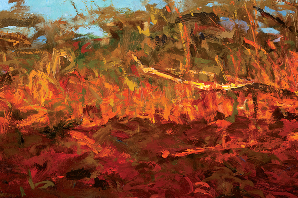
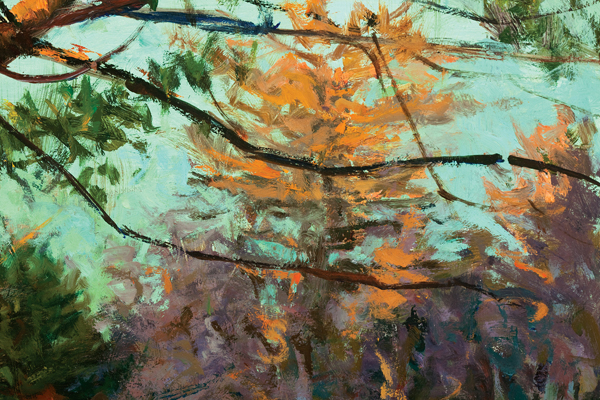
C - Pine Needles
I broke the shape composed of the pine needles into two parts: the light and the shadow. I used oranges, yellows, reds and warm greens for the light area. In the shadow I used the same colors, but deepened them in value. I also made these darker mixes cooler. To be clear, I used an influence of blue by desaturating the color without using blue itself. In both the light and the shadow, I used complementary notes to keep the color varied and interesting.
Take note also of that little patch of blue-green snow in the upper left corner. I placed this cool area in my composition to contrast with the overall warm light.
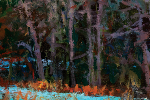
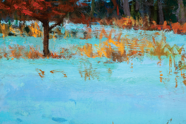
D - Tree Line
I'm always cognizant of the color relationships within any given area of a painting. By using small bits of cool color of a light value between the limbs of the trees, I suggested the field that lies behind the tree line. This detail works as a complete painting in itself. The darks, the lights and the colors create the dynamics of this section.
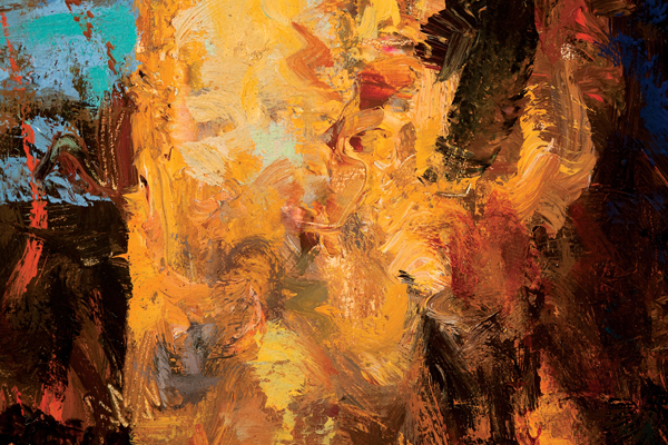
E - Highlight on Base of Tree
POW! Talk about color and vibrato—I used every trick in the book to create variation of color and light. Notice how all marks mingle but don't blend, creating transitions of light to shadow. I didn't complete the marks of paint with one pass; applying color here is a weaving process.
Much can be gained by making changes in temperature rather than value. Observe in the yellowlight group all the subtle notes of lavenders, grays and greens, which heighten the effect of brilliant light. This is capped off with a relatively cool highlight made with a mixture of viridian green and white brought up to the same value as the yellow that surrounds it. I achieve the overall effect of the highlight through temperature change—in this case, a cool highlight on a warm surface—rather than value change.
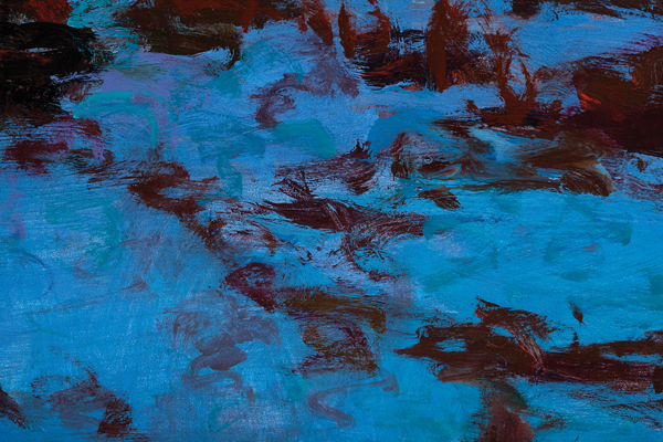
F - Shadowed Base of Tree
The blue notes in the shadowed base of the tree are reflected light from the sky. Once again, the principle of temperature change rather then value change is at work.
I placed some warm passages with irregular brushstrokes to suggest weeds and grass. These marks help anchor the tree to the ground. Varied directional strokes, colors and values create a believable space.
G - Distant Upper Right
I create the atmosphere with color and edge control. The late-day sky illuminates the top of the tree, so I laid yellow-orange light on top of a lavender base. I used the warm, soft edges of the treetop against the relatively cool sky to maintain the tree's place in the background. The dark marks of the closer tree branches push back the tree line even farther.
-- The Artist's Magazine, November 2011
__________________________________________________________________________
Peter Fiore is an award-winning landscape artist known for his handling of light and color. He teaches at the School of Visual Arts in New York City and also leads workshops. For more information go to www.peterfiore.com.
__________________________________________________________________________
 More Articles More Articles
About Peter
Paintings
|
